Your Website, Your Logo, Your Content all are important, but what is equally important is colors. Welcome to the Definitive Guide for How to Use Color Psychology in marketing. Colors can massively influence sales, user retention, user experience. For it, you need to focus on Colors, more specifically Color Psychology.
Here we are gonna show you how to use Color Psychology for marketing. This can bring a massive impact and gain you a lot of success.
So Let’s jump right in.
What is the Color Psychology? And Why is the Color Psychology Important?
Color Psychology plays an important role in our lives. Colors connect to our feelings, they can manage our mood, they can make us worried or stressed too. Proper usage of colors can be a powerful tool in marketing.
Be it your site, your ad campaign, or your social media post, color is the first thing that will catch the user’s attention when a user sees your content.
What Is Color Psychology
Kissmetric’s infographic, predicts that about 85% of people shopping online take their decision on color alone. Also, proper use of color leads to an 80% increase in brand recognition.
Here’s a warning: Too much color is as bad as too little color. Too little color can make content flat and unappealing, and too much color can make your content distracting.
Humans are born lazy.
Yeah, I know you are super lazy sitting on your couch all day, but I am not talking about that.
But in general, humans want quick information. Sometimes too much information can make humans avoid it altogether.
As a result, your colors should be used to highlight only the most important parts of your design. For example, the Call to Action buttons such as Add to Cart button should not be the same as say your Privacy Policy link. Sure both are important for customers, but you want your customer to have attention directly to Add to Cart button.
That’s why the Definitive Guide to How to Use Color Psychology for Marketing will definitely benefit you by teaching you important concepts about color.
There are many other tricks and ways used by big companies for competitive advantage.
For example Apple used to have Steve Jobs’s Reality Distortion Field, as a tool to do the unthinkable.
How does Color Psychology work?
Every human is different, and every human responds differently to different colors. There is no real science that has accurately proved the impact of a particular over humans.
But if data and experiments are to be believed, some common colors associate with a particular human behavior for the majority of humans. That’s why it is important to understand how to use Color Psychology for marketing.
Clearly shows, how humans have assigned a particular color towards a particular meaning.
Though the meaning can widely differ for a particular color, some cultures have some specific meaning for colors, younger people prefer more saturated and vibrant colors, as they symbolize energy. Females usually have some different color choices from males, and then individual preferences can also affect it.
Take this example, imagine a big warning sign, what color is it? Red, imagine a traffic light to stop, what color is it? Red, imagine a fire extinguisher, what color is it? Red.
So what’s up with red? Well, humans associate Red with danger in general, why so? There is no particular reason, but our history suggests, that Ancient Human, was a hunter, and was under constant threat of animals.
Color psychology can largely direct the behavior of your customers to your marketing messages based on the color of your copy, buttons for call-to-action, and links, and various other design elements.
Seeing blood on the body was a clear sign of threat to life, and as a result, Ancient Human needed to take immediate action, this leads to humans mind considering bleeding to be something wrong, and as Blood is red in color, humans associated Red with Danger, so that when the mind sees Red anywhere on the body, it’s mind immediately thinks danger.
And that’s how Color Psychology works, and we get to know about how different colors dictate different behaviors in humans.
You can exploit the Color Psychology in marketing and branding your company.
What Exactly Do Different Colors Mean?
Each color can have a different effect on humans based on the situation, for example, we discussed how Red is also used for danger, but Red is also the color of energy, but Red is also the color of love.
That’s why researches show that humans find the opposite sex more attractive in red color, so that’s a pro tip when you go out next time on party, wear Red, Color Psychology will help you be attractive.
Similarly the color Green can have different meanings, when shopping for food it can make our mind think something is healthy. While Green is also a color for Wealth, that’s why brands like Starbucks use it.
So there’s no hard and fast rule of what exactly a color represents, there are multiple things that color can signify at the same time.
Red
The color Red is useful to stimulate urgency, hurry. It is observed that the color red increases Blood Pressure and Heart Rate, and also it increases hunger.
That’s why McDonald’s uses Red color accents all around the globe to stimulate hunger, now you know why you find it is so difficult resisting from taking large fries with your Big Mac.
Green
Plants are green, so the Green color is directly associated with healthy things, that’s why Whole Foods & Subway uses Green Color accents to hint your brain about Subway being healthy.
Besides that, cash in money countries is green colored, so green also represents wealth, when you want to feel rich use Green, similar to what Starbucks uses in their products.
Blue
Blue represents peace and tranquility, the Color Psychology suggests that it comes from the Blue Sky, perfectly calm and peaceful.
Blue is used in Color Psychology in Marketing for representing “reliability”
How do Big Companies Use Color Psychology to Exploit Us
Before getting deep into the Definite Guide for How to Use Color Psychology for Marketing, let’s see How we have been a victim of Big Companies that have been using Color Psychology for Marketing for years.
There are many examples of businesses using Color Psychology.
As a businessman it would be really important for you to use colors to your favor.
Incase you are trying to become an entrepreneur then it’s even more important, because at start you lack money and other resources.
Colors can give you an advantage that costs nothing and can work like magic.
Also checkout How to Become an Entrepreneur with no Money in 2021
We all know how Restaurants and Hotels offer us soup, as the soup is an added expense, but also soup increases our hunger further, thus compelling us to order even more food.
But there are color-related aspects also. Purple is said to be a “Hunger Inhibitor”, it is a color that is observed to reduce hunger. Whereas the shades of red and yellow are said to be “Hunger Promoter” and it also represents friendliness, food chains use shades of red aggressively and avoid purple as much as they can. They would even build their restaurants such that the benches or other aspects also avoid Purple.
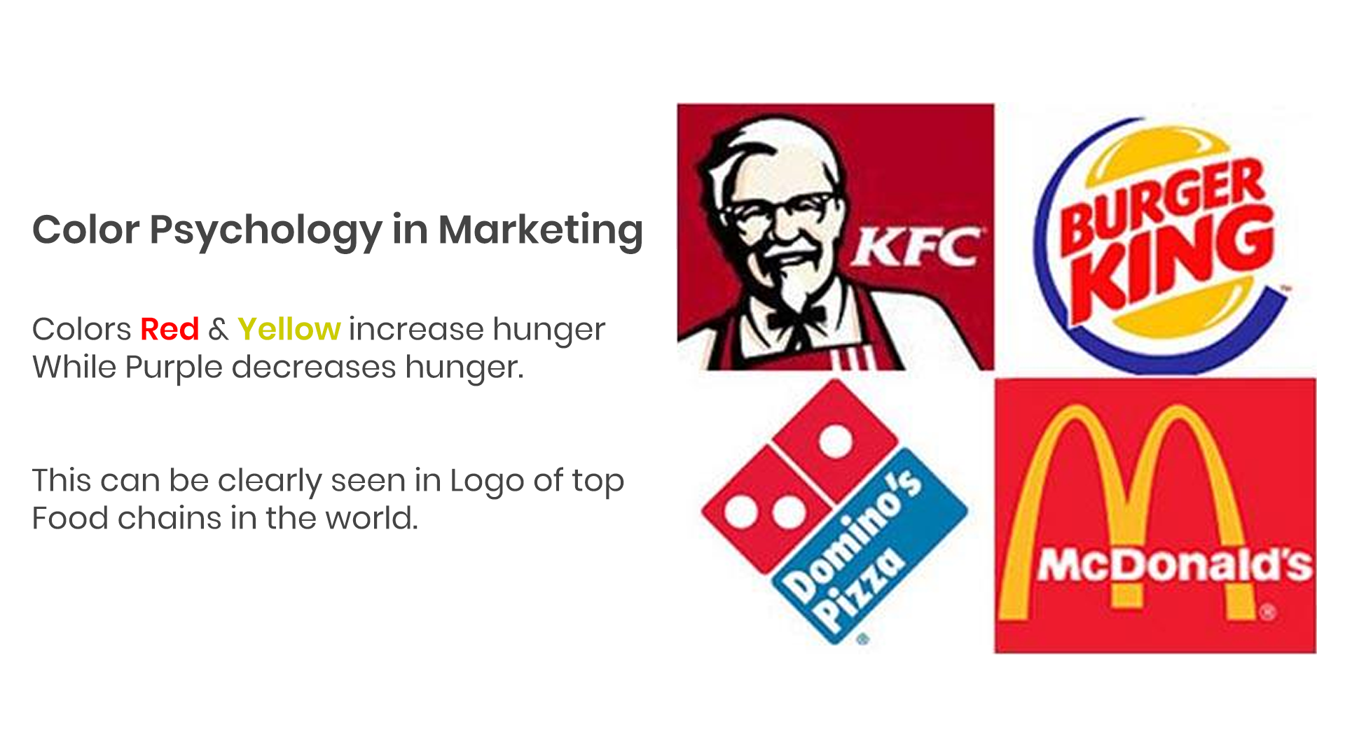
Food Chains And Restaurants Prefer Red And Yellow In Marketing
Some businesses rely a lot on trust-building, for a food company, if you don’t like food you would choose some other restaurant, but there are other businesses where customer use their product for a quite long time before replacing, these businesses rely on trust-building more than anything else.
Another common example is how Hospitals use a bluish shade of Lights in their buildings.
Humans are observed to become sleepy with Yellow light, as Yellow is the color of the sky at sunset, and our brain interprets night time, and thus prepared body to sleep, whereas blue is the color of the sky really early in the morning, and thus Blue prepares us to wake up, this little hack, allows the family/attendant of the patient to stay awake for a relatively long time.
This trick of Psychology of Color is used for benefit of the customer, but do note, that if the attendant feels good, he is more likely to recommend the hospital in the future.
The food industry is one of the biggest industries in the world and has huge competition. Color can play a huge role in these industries.
Orange is used by companies like Nike, and fashion brands Hermes, Nickelodeon for building trust. Entrepreneur suggests that a peachy shade of orange is really good for such markets.
These tricks have been used to build brand value for quite a lot of time.
I will help you understand how to use Psychology of Color in marketing for your company, by giving useful advice for choosing correct colors, and other important things to remember for secondary shades.
But before that, I need to point out a striking observation made by Canva about Colors used by Top Companies and did an amazing discovery.
They analyzed the logo of Fortune 500 companies, and found that Blue was really dominant among the LOGOs, Purple was scanty, and Pink was not at all present in the logo of 500 companies.
This shows how companies are intentionally trying to avoid colors of less meaning, and using colors among primary Red, Green, and Blue. This is a really important observation and should be used in Color Psychology for marketing.
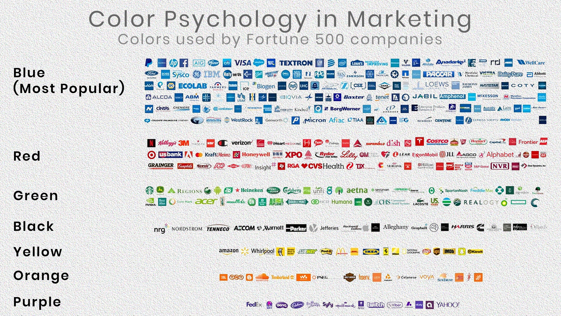
How To Use Color Psychology In Marketing. Colors Used By Top Companies In Their Logos
Hence a Pro Tip: Avoid Pink and Purple in LOGOs and prominent placed, and prefer primary colors Red, Blue, and Green based on what you want.
So now you have seen how different companies use Color Psychology for marketing and branding.
Now let’s head onto How can you use Color Psychology for your company’s marketing and branding.
How to Choose the Right Color for Branding and marketing
Many factors govern which colors you should choose.
Gender
One of the biggest lies we have been told is Women and Men are all the same, it’s totally false. And this discrepancy exists in Color Psychology too. The colors that women prefer vary from colors that men prefer, though there are some similarities in choices, there are huge differences too.
If you target a particular gender majorly, you should use preferable colors of that gender to implement color psychology in your marketing.
Women tend to prefer tones of Blue, Purple/Pink, Green, and Red.
Whereas men prefer Blue, Black, Red, and Orange.
Blue is the most common and most preferred color among both genders. The color green is the most gender-neutral color, as a roughly equal percentage of men and women like green color.
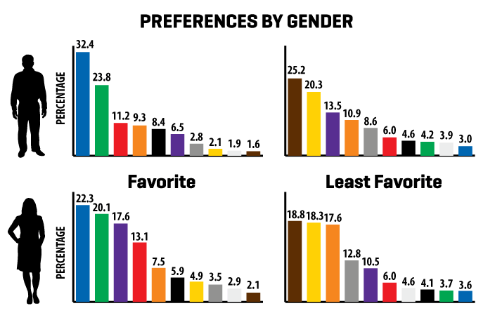
How To Use Color Psychology In Marketing And Branding By Targeting Gender Color Preferences
Age
Age is also a common demographic, kids prefer to love brighter colors and friendly colors.
- Kids do not like Black, Kids love light shades of Yellow, Blue, and Red. In general, orange is a friendly color too, so light shades of orange.
- Teenagers and young adults build interest in Red, blue & golden yellow.
- Adults start to like the traditional 3 colors of Red, Green, and Blue, with a strong affinity towards teal and dark green too.
- Old age people are known to prefer unsaturated colors like Beige, Lime Yellow, Light Pink, and similar shades.
So age can be a really important factor, colors widely
Location and Culture
While the location is a common factor, people don’t realize how different colors can have drastically different meanings based on culture and location.
The meaning of cultures can vary a lot based on location, and this happens beyond Color Psychology. The meaning of Colors is really important in marketing.
I am an Indian, and here a shade of Orange, which we call “Bhagva” is considered really sacred, it represents energy and well-being.
Similarly, there are a lot of location/culture-based meanings of colors, which can be used as a part of color Psychology in Branding and Marketing.
The color Red represents Luck and Happiness in China, that’s why they send red colored envelopes are sent on Chinese New Year.
Whereas in Africa the Red color symbolizes Death, Pain, and violence.
In the majority of other countries, red is considered a color of love, symbolizes passion, and is sometimes used for signaling threats too.
Similarly the color green is considered quite sacred in Islam, and that’s why in the middle east the color green is considered lucky and is a preferred color there, it symbolizes luck, wealth, prosperity besides sacred values.
There are many strikingly different meanings of some colors, the color white is generally considered the color of peace and purity in most parts of the world, whereas, in China and Korea, white is a symbol of death, as a result, White is worn at funeral events in China and Korea.
How to Use Color Psychology for Marketing and Branding
So now let’s begin with implementing Color Psychology on the Website and using Color Psychology for campaigns, buttons, images, and many other places for perfect marketing.
But before that let me address 1 common FAQ
Is 1 Color enough?
The answer is NO. Each color has its own value.
What, but didn’t I say you need to select colors carefully, and each color has its purpose, etc., etc.
what’s the point of color psychology in marketing if 1 color is not enough.
Don’t think this Definitive Guide to Use Color Psychology in Marketing and Branding is bull shit, trust me it is good.
The point is some colors have to be used besides your color scheme. For example, say you are targeting Middle East Female Adults and the Elderly, for e-commerce products, the perfect color for this demographic is discussed earlier is green/dark green.
As a logical person, you would select Green as the site color scheme.
But, there are things where green won’t work, for example in case of a sale, the banners and countdown timers that are used for creating urgency won’t work well in the green. Red and Orange are far more effective in creating urgency to buy something.
In other instances say a cross icon, or a button to remove the product from the cart, should be red, because red gives a vibe of warning, so you want your customers to avoid the button until fully sure.
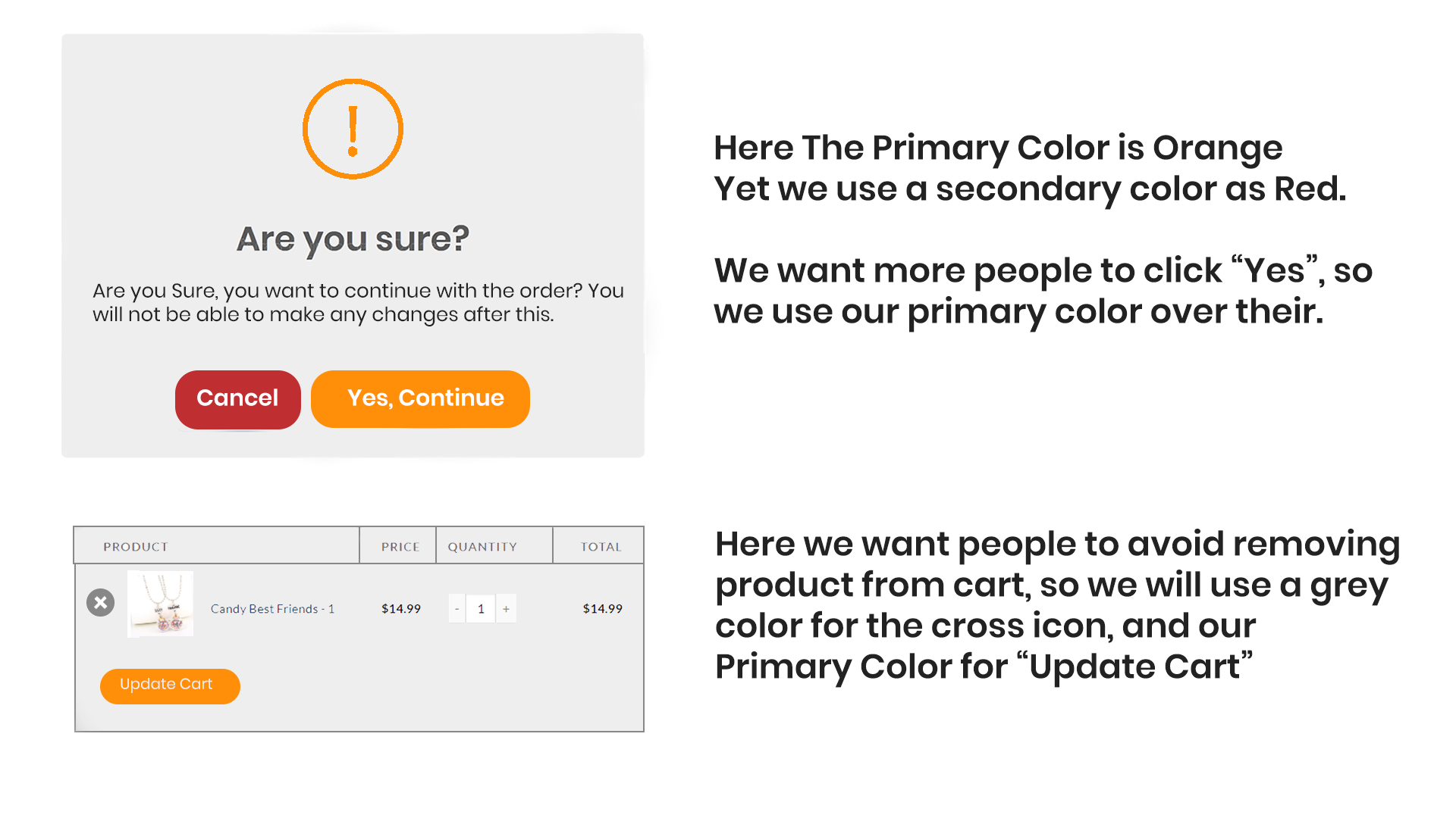
Primary Secondary And Neutral Colors Used In Color Psychology For Marketing
So you need to use various colors, a Primary color is selected based on the demographics of your target audience, but various other colors are used in minor proportions for specific works. Use Orange/Red for Urgency, Red for warning.
Where should I use my Primary Color for Branding & Marketing
The Primary Color is to be used aggressively across your brand, to be able to properly use Color Psychology for marketing and branding.
As I said there are places where some other colors are to be used, but they are really specific, for example, a cancel icon/button should be red, to help people avoid that button. Notification for limited stock or limited time left till sale ends should be in Red or Orange to create urgency, but in the majority of other places your primary color scheme should be used.
These other colors are like salt to food, if you have to make Pasta, you obviously need Pasta, but without proper salts and spices, Pasta would be too boring. These other colors used when necessary are the salt that you use in Psychology of Color for Marketing.
But where exactly should you use your Primary Color? Well, our Definitive Guide about How to Use Color Psychology in Marketing and Branding has the answer for you.
- Headlines,
- Borders
- Popups
- Logo & Icons
- Landing Pages
- Emails
- Social Media Posts & Campaigns
- Products Designs and Marketing
So you see the marketing is being used everywhere from photos to videos to site to emails to banners to icons.
Excess of Everything is Bad
Every one of us must have heard the above quote at least once in life. This quote is true while using Color Psychology for marketing and branding too.
Do not put everything in your Primary Color.
Text and other regions can be kept in normal black and white combination too. But whenever something important use the color scheme you decided.
Try to balance the existence of your color scheme and the simplicity of design.
Say you are having a restaurant your primary color should probably be orangish-red, that means your graphics would have a dominance of your primary colors, chairs and tables can have the same shade too, but that doesn’t mean your Toilet Seat should also be the primary color, similarly, your buttons, images, borders, icons, and popups should have visually a lot of primary colors, but normal text and unimportant sections can use normal colors like black and white.
Too much use of primary color can create a sense of confusion, so don’t go overboard: reign in your color scheme with white. Humans want to focus on 2-3 things on a page at max, finding more than 2-3 things highlighted in primary color might confuse customer, and he might ignore that section and move to next due to it.
How do you decide?
Well here are 3 things to consider about how NOT to overdo the use of Color Psychology in Marketing and Branding.
- Contrast. In simple terms, contrast is the difference between two colors. Your design should have proper contrast to improve readability as well as get the customer’s attention towards the important element in your marketing. Whenever you are in doubt, the thumb rule is to choose a very light shade of primary color for the background and a very dark color such as a shade of black for the content itself.
- Complementation. Unless you are a Graphic Designer you won’t understand it well, but in short, complementary colors are colors that are found on the opposite side of the color wheel. For example, red and green are complementary colors, similarly, the colors blue and orange are complementary according to the Color Wheel. These colors should be used to add depth when needed, do not overuse the complementary color, the focus should be your main color, but sometimes the main color causes design elements to get overcrowded causing consumers to be distracted, here complementary color should be used.
- Vibrancy. It refers to the general mood of particular color sets: the brighter, warmer colors (dark red, orange, warm yellow) tend to energize us while darker and cooler shades are generally considered more relaxing and tranquil.

Complementary Colors In The Color Wheel
Experimentation is a Virtue
Experimentation is a Virtue.
Science has studied a lot of Human Psychology, yet the puzzle is far from solved.
While a lot of what I said in the Definitive Guide for how to use Color Psychology in Marketing and Branding has been proven with time, there are a lot of things that you would yourself have to experiment and figure out.
Say you are developing an energy drink for Adults in India. Adults prefer the colors Red, Green, and Blue, but you are selling a food item, and I earlier showed you how, Food Industries prefer shades of Yellow and shades of Red colors and avoid Purple.
So you might consider Red for the color of your drink, but at the same time, India considers the color Orange as a symbol of energy. So an energy drink will be good with orange color.
As it represents energy, an Energy Drink brand may use Orange in their color scheme in India also.
Which color do you choose?
Think Think?
You need to experiment with both colors and figure out the perfect answer based on how your customers react to it.
In case you are not very willing to spend money on experiments, ask random people who fit your demographics for the color they prefer.
Conclusion
Humans unknowingly and unintentionally respond differently to different colors, and their behavior can largely vary based on the colors that they see. The total study of human behavior due to different colors is called Color Psychology.
Our Definitive Guide for How to Use Color Psychology in Marketing and Branding teaches you how to use Color Psychology to increase profits/sales by just using the right colors.
Some colors are universally accepted to have a particular meaning, for example, red is used for warnings and threats, green is used for representing something healthy or safe.
Big companies have used colors for their benefit for many years, food chains know that the color Purple reduces hunger, that’s why they rarely use purple, whereas the color red and yellow increase hunger, result companies like McDonald’s and KFC’s use Red and Yellow in their company aggressively.
Like these big brands, you can also use color psychology in marketing and branding to increase sales and revenue.
In business, you would need a primary color for your branding, this color will help you become recognizable, whereas you have to occasionally use other colors also when needed.
Analysis of the Logo of top 500 companies shows that the Color Blue is repeated in most of the company logos, purple is rarely found, and Pink is totally nonexistent.
Similar results were seen upon analysis of favorite colors of both genders. The favorite color of males and females turns out to be blue.
Most of the big companies implement color psychology for their companies
Besides the generalization in color choices change based on Age, Gender and Culture too. For example, most of the Islamic countries have a love for the color green, as Islam considers Green as a spiritual and lucky color. Chinese consider white as the color of death, so based on location and culture some colors are preferred while others can be avoided.
So when you try to build your brand, you should choose your primary color carefully considering all factors about preferences of colors, and then use it. The primary color should echo everywhere from Logos to Emails, to Website content to popups to marketing banners to product packaging.
But there are certain places where you should avoid your primary color. For example, in the case of an e-commerce website, an add to cart button should be in primary color, but you want people to avoid removing their products that are in the cart, so remove from cart button should be in some other color (say red) so that people avoid clicking it.
In the end, while science has explained a lot of mysteries of Color Psychology, a lot of experimentation is required for finding the perfect color for your brand to successfully implement and use color psychology in marketing and branding.
#marketing #Branding #ColorPsychology #PsychologyOfColor

Comments