We hope, you are safe at your homes, these are tough times, for all of us, and we collectively need to go through it, please wear mask, maintain 6 feet distance, wash hands frequently, and build up immunity, because our fight against COVID-19, will be won, only from collective effort. So, it’s been 2 months since we talked about what’s new, since you were at home, we were still hard in developing and improving Milyin, in really good ways.
We got some cool new stuff, and this time, it is majorly centered on Creation Interface, which got it’s biggest overhaul, since we started Milyin. Besides that, we updated our Creation Guide, with some better explanations, and in accordance to the new Creation Interface. One of our Admin at Milyin, Jiten Kumar, rewrote the Milyin’s Creation Improvement guide, which had not been updated since ages, we included latest context, and Best Practices, and how to do them, as per the new Creation Editor. So let’s jump right in, and disuss everything cool.
We got some cool Speed Improvements as we started using Optimole CDN for Images, which serves WebP, scales Images, does Lazy Load, and overall image compression. We have seen major performance jumps using it since the last 1 month, we hope that you also like it.
General Improvements
General Improvements, are important. Because with time, we learn things, and when we spot mistakes, we should be doing Course Correction as early as possible.
Navigation Bar
Milyin’s has always struggled to find the right recipe, for the best possible navigation bar. If we add too many things. then it becomes cluttered, and people get confused, and if we add too less things, then people dont find relevant stuff.
Our innitial approach from 2018, was to Have sub menus, We had a Parent Menu, with 5 items, and then each one had stuff related to it. This was cool, and looked clean, but the problem, was that a general user isn’t patient enough, to guess which menu would have the thing he is looking for, and therefore, many a times, he would have to guess the URL, even when the thing was present in Menus.
We could not directly include everything without submenus, because they were total like 20-25 menu items, and it would be really screwing up users, into so many links. And therefore we did a new approach. So came our approach from 2019. In 2019, we tried, to guess what a user wants, based on the current page.
So made 1 large menu, with about 10 items, out of which first 4 items, remained fixed, but the rest of ite So, if a user was on New Creation Page, we would show him, things like My Creations page, Draft Creations, Creation Guide, and Creation Improve on the page, whereas say he were to be on Discover Page, we would show Chat, User, Account page in the menu.
While this approach was effective, as we had it a little contextualized, we with time realized that, the navbar with more than 5 items, is still too heavy on desktop, though it was fine for mobiles. So came our New Approach, which was to, combine what we learned from 2018, and 2019, to build up the 2020 version.
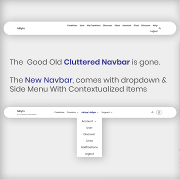
The 2020 version, comes with 4 items, in main navbar for desktop, along with some other items, which are enclosed under a Click-to-Reveal side menu. The benefit is, that we can have less clutered experience on desktop, while still giving lot of information. People may find it difficult to dig deep into sub menus, and find stuff, so we have the side menu, has 6-8 other items, which are contextualized like 2019.
So combination of lots of items grouped, and some hand picked, contextualized ones, solves the purpose of being less cluttery, while still being extremly useful. On mobile, the nested menu moves into the sidemenu, as it has been in earlier versions.
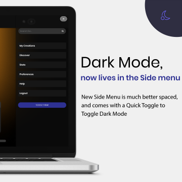
Dark Mode
One such thing we did was with Dark Mode, Dark Mode toggle is available only at bottom of Creations. Which most people never notice. And as a result people aren’t able to enjoy our Hard Work done on Dark Mode.
Therefore, we decided to add the Toggle Theme Button, to the Side Menu, so you can click the Side Menu toggle, and in the Side Menu you have “Toggle Theme” button.
Basically making it much more prominently placed, and much more easy to access, though there is one exception, we do not allow you to Toggle theme, when you are in Creation Interface. This is to reduce the files needed. Our Creation Interface is already really heavy in code. So, adding Dark Mode toggle, can crash some old phones, and therefore, we decided not allow it there.
Creation Guide
Milyin’s Creation Interface, has got really massive changes, and therefore, even before we discuss about it, we wanted to make sure, that all our Creators, get a smooth transition to the new Interface, as specially the Action Bar, Customize Section, and Creation Editor, have got a major overhaul. So we proactively updated, our Creation Guide, to match with the Creation Interface, and we have included as many relevant images, as possible. We like always have gone to extreme lengths, to make sure, that you have better experience understanding the Creation Interface. The images that you see in your Creation Interface, have been given an additional touch too. If you read Creation Guide from a phone, we show you photos of Creation Interface as it looks when seen from phone, but when you look at it from Desktop, we show you images of how it looks when seen on desktop.
Moreover, if you view it with Dark mode turned on, then Images would also be having Dark Mode on.
We have worked really hard in perfecting each and every detail needed. And we have mentioned everything from basics, to some Pro Tips, these Pro Tips can save your time, and be an amazing help.
Read the Creation Guide
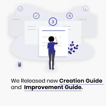
Improvement Guide
Creation Improve has been at Milyin for quite some while, but it had aged well. Creation Improve was meant to tell Best Practices, and some Guidelines, which aren’t compulsory, but surely can Improve experience, for the Content Consumers, but many things have changes and with Introduction of many new features, Milyin needed a much more robust and detailed guide.
Therefore we Introduce, Improvement Guide. The Creation Improve is being Replaced by Improvment Guide, and as was the demand for the time, it is far more deep, robust and well written. The Improvement Guide brings forth some great recommendations and great insights about things you should take care for better experience for the people who read your Creations.
In order to get a great experience, for people who consume content, many things like a fast loading site, good design, good colors and great content, along with many other things are important.
As you are a part of Milyin, we manage the Site Speed, Design, Security and many other things, without you bothering about anything else.
Your only work is to Create Content, and there are many things you can utilize with it. Our goal is to make it impossible for Creators to create Bad Creations. And we build lot of features for it, in order to ensure you are utilizing it all, the Improvement Guide was built.
Read the Improvement Guide
Creation Interface
Creation Editor is a big one. Creation Interface has got it’s biggest update since we started Milyin. Creation Interface has got a lot simpler, much cleaner, and got many new features, and we are excited to talk about it.
The Distraction Free Mode is gone. The Distraction Free Mode which toggled from the button on the right side of Creation Interface is gone. And it has gone for good, we have done lots of Designing Hard Work, to ensure, that things consume minimum space. We have created an extremely space effecient design, so that we can give you maximum working space yet a lot of tools.
So, first of all the Milyin’s Navigation Bar, is now static rather than fixed. On any other page at Milyin, the Navbar remains fixed to the top edge of the screen. We feel that the NavBar is not that important when writing Creations, therefore you need to Scroll to Top to access it.
The Save button, and Creation Status Selector, which were fixed to bottom edge, have been moved. The Save button has moved to the top of Interface, in what we call the “Action Bar”
Featured Image
Featured Image Selector got a minor yet important change. You must be familiar with the Image preview, of The Featured Image that you see on top of Creation Interface. Earlier whenever you changed featured Image, the Image Preview would not update to show the new image. To see the new Image, you had to specifically refresh/reload the Interface to see the updated interface. Not any more, the Interface now shall automatically show the updated Featured Image.
The Action Bar
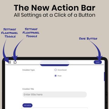
The Action Bar, contains 3 buttons, which are: Settings FloatPanel toggle, Customize FloatPanel Toggle, and Save Button. We shall come onto the floatpanels in a minute, but lets discuss the Action Bar further. Action Bar remains fixed to top of your device, untill you scroll to top of page. It’s Translucent, and it’s just 38px meaning that even on the smallest screen it shall occupy less than 15% of total working space.
Our innitial idea for Action Bar was to make it fixed to bottom, but as it turns out, Bottom fixed works fine on Desktop, but in most cases on Phones, the approach for top is better. As it prevents accidental clicks.
Moreover over the years, we have recieved some complaints of it conflicting with the Gesture Navigation on iPhones released after 2017, and Android Phones running Android 10+. Therefore it was best to keep it at top.
We believe that while Creating, you should spend time on Creating Content, rather than being puzzled with so many settings.
As the list of features and customizability got bigger on Milyin, we needed to group the customiability options, and settings as people wont touch them that often.
Plus based on your Taste, you can set the default Configuration for all Settings and Customizability in Milyin Preferences. Thus further improving your Creation Experience.
Since a few months, Milyin has “Your Creation has been Updated” notification, that comes whenever your Creation is saved. We realized that it can be distracting in some cases, and also sometimes break the flow when typing. So we decided to club it with Action Bar.
Whenever your Creation saves, it smoothly transitions into a banner saying “Your Creation has Been Updated”
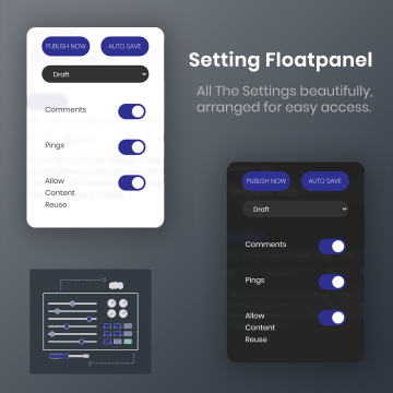
Floatpanels
Floatpanels are 2 Panels, that can be seen by clicking there respective Toggle buttons in the Action Bar. These Floatpanels are namely, “Settings Floatpanel” and “Customize Floatpanel”.
The Floatpanels reveal from Left when toggled to open. And they hide if you scroll to top, so as to make place for Navbar.
The Settings Panel, has the options to select the Creation Status, Auto save, Publish Now, along with 3 Toggles, for Comments, Pings, and Content Reuse.
If you have been an old user you shall remember that the Autosave and Publish Now button were at the extreme bottom of the Interface, and most of the Creators ignored it, and yet Autosave and Publish are really handy.
We believe they deserve to be placed much prominently, therefore they were given a place in Settings Floatpanel.
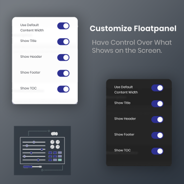
The Comments, Pings, Content Reuse etc, and all of the options in the Customize Floatpanel too were radio buttons, but we realize how big of a mistake to not use the “Toggle Buttons” therefore we corrected it as we realized it.
Now all the Toggles are Toggles rather than Radio Buttons.
The Customize Floatpanel brings forth, the options to show/hide various element of your Creations, so as to decide how you want your Creations to look on Frontend.
Creation Editor
The Creation Editor is new, fresh, and useful than ever before. We have addressed many problems and brought many new features.
There are many new features one the biggest one is Spellchecker. Spellchecker, helps you correct your spelling mistakes, so as to give you much Professional Capabilities.
New
Spellchecker is available in 13 languages. You need to press the Spellchecker button, so as to make Milyin scan through your text and find out probable mistakes. We shall underline the words which we think are wrong, with red colored line. Right Clicking it shall bring the suggestions for the same.
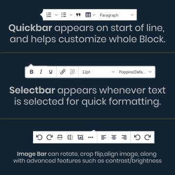
Quickbar is another new feature. whenever you are at start of line, there should be a bar that should appear, with ability to create List, Table, Blockquote, or Heading directly from there. It’s a quick tool, saving the hastle, of having to go to menus and finding what you want.
Selecbar is you select any text, then you shalll be greeted by a bar, that shall have the options for Bold, Italics, underline, link, font size, font style. These are time saving quick features, and thats why we call it Selectbar.
Format Painter can be used to copy formatting/style that you have done for a particular text, and then paste it to another peice of text.
Image Bar can be used to access quick settings such as rotate and align and also has option to expand the Image Editing tools, Which we shall discuss in the next point.
Image Editing is a new thing, the Images are another important thing, Milyin’s Image Uploader has really good image editing tools for doing basic stuff like, cropping, flipping, resizing etc. But sometimes you put same image at multiple places, or you want to keep orignal image untouched. So We now have Image Tools, in Creation Editor, you can apply basic changes after inserting image, and that changes would remain to specific to that specific instance of Image, your orginal image would remain same. The features include, rotate, flip, crop, resize, and some advanced edits like, brightness, sharpness, contrast etc.
Enhancements
Dark Mode: Now the Creation Editor also lives in dark, the new Creation Editor, now has been skinned for Dark Mode compatability, making it look much more uniform in relation to rest of the site.
Wordcount: Wordcount on the earlier version of Creation Editor, did not update count while typing on phones. Rather it did that, only when we entered a new Paragraph. Not any more, Creation Editor now continously updates the Word Count.
Toolbar: The Toolbar is now much smaller and much dense. On smaller screens rather than splitting the toolbar to next row, we now allow you to scroll horizontally, or use a button to expand the not visible items in the Floatmenu, which occupies minimum space.
Menubar: The menubar on Milyin, is now Sticky, as you type your Content, sometimes, you can be so engrossed, that scrolling up to get the text bold is an awful thing, therefore, we fixed the Menubar to top, so that the Menu, and the toolbar by itself always remain visible to you, whenever you are typing.
Thats all with what we have been doing in the past few months. Hope you enjoy it. We shall keep developing and improving things further.
Regard,
Milyin,
It’s The Passion That Matters,
You can also refer to our documentation including FAQs, Help, or Creation Guide
Milyin
It's The Passion That Matters
@milyincreators
It's The Passion That Matters